Cholera in the 1800s
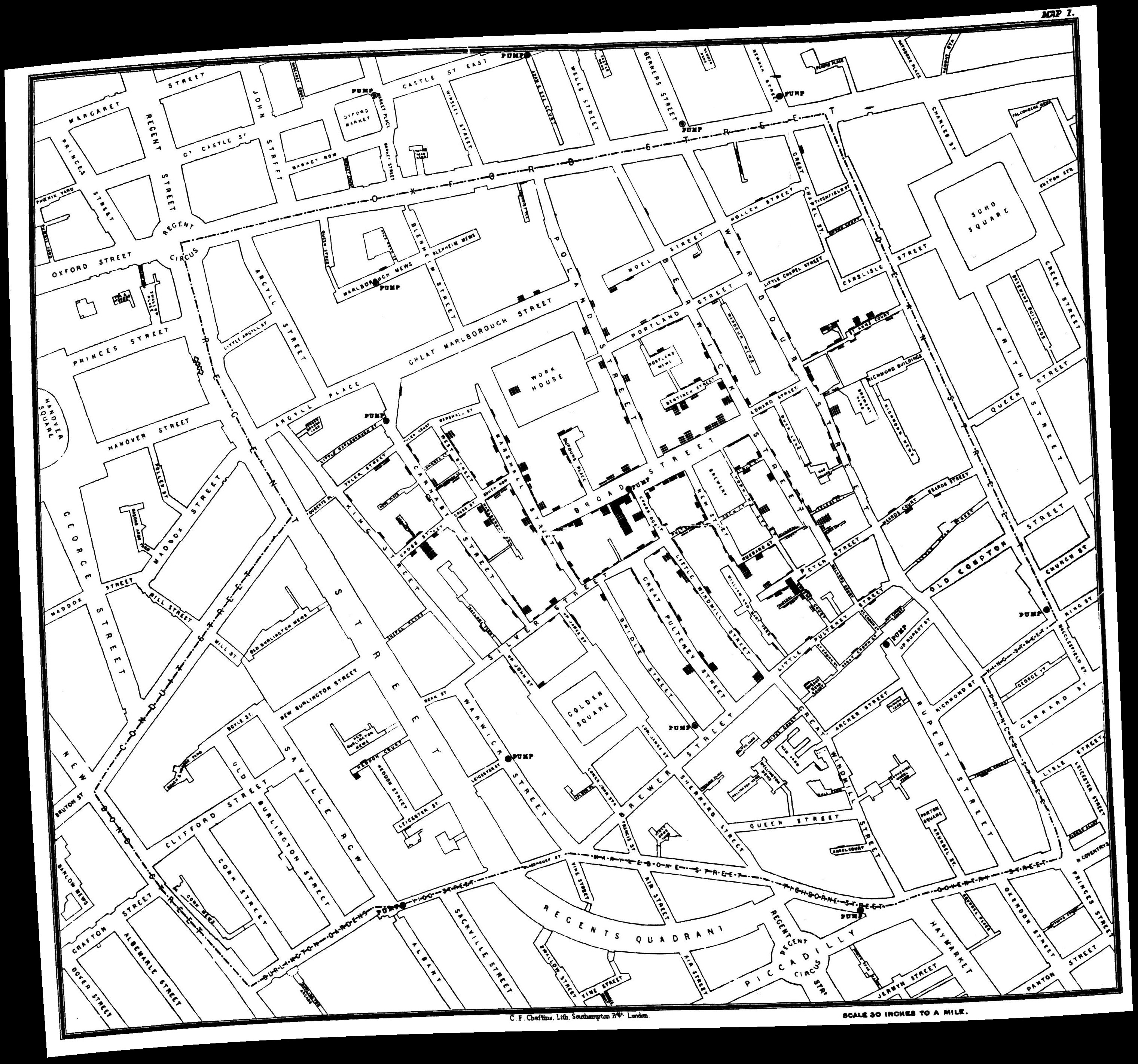
In the mid 1800s, cholera outbreaks were common around the world admist the cholera pandemic. In 1854, there was a particularly bad outbreak in London known as the 1854 Broad Street Cholera Outbreak. This particular outbreak became well known thanks to Dr. John Snow’s visualization and subsequent hypothesis that poor water quality was the cause of cholera.
Visualizations
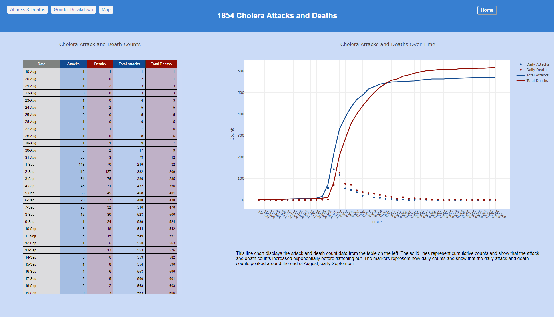
The first set of visualizations includes a basic table and line chart to visualize the attacks and deaths over time during the 1854 outbreak.
See the full visualization page
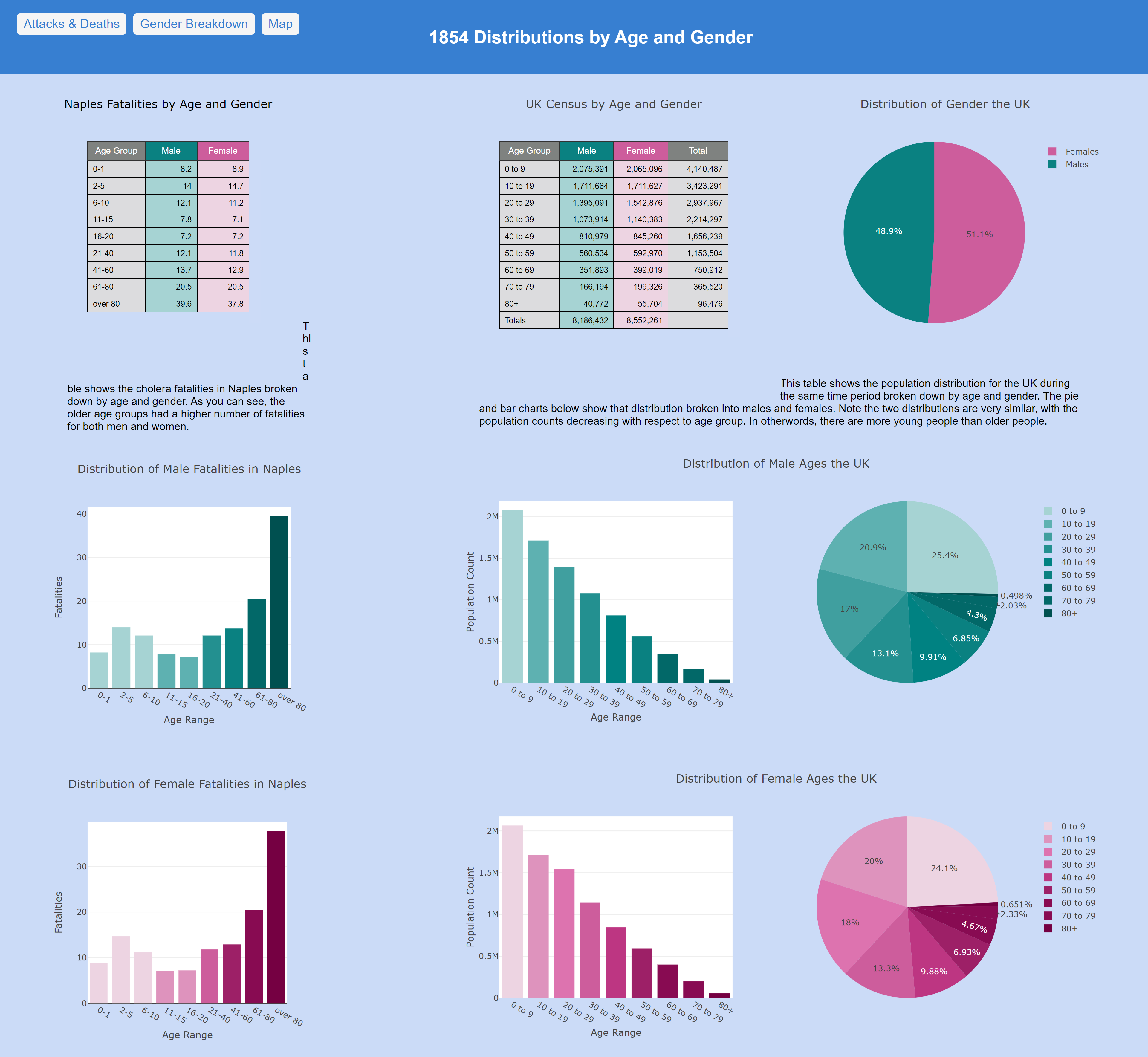
The second set of visualizations breaks down fatalities data as well as general population data by age and gender. We notice that overall there are more fatalities in the older age groups than any other, even though the population distribution shows the older age groups being much smaller. This is a good indication that the older age groups may be at higher risk of death from cholera.
See the full visualization page
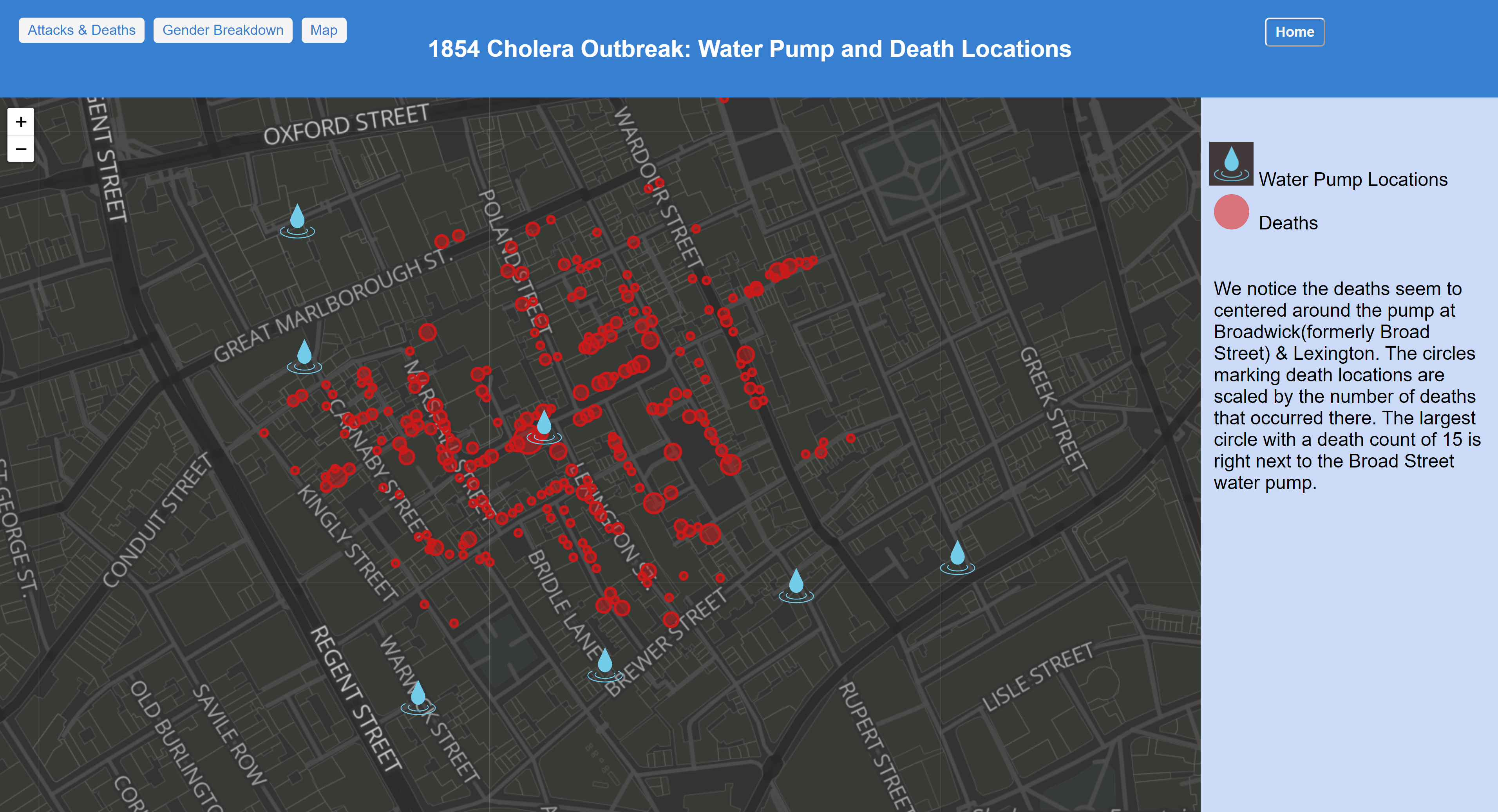
The final visualization is the closest to Dr. John Snow’s and maps out the locations of water pumps and locations of cholera deaths from the 1854 London Outbreak.
See the full visualization page
Credits
These visualizations were created by Katrina Turner for ICS 484: Data Visualization at University of Hawai’i at Manoa. Plotly.js was used utilized to create the various graphs, charts & tables and Leaflet was used for the map visualization. All data used for these visualizations was created and compiled by Robin Wilson (www.rtwilson.com/academic) and can be found in the data folder of this project’s Git repo.