Kāne'ohe Bay Mantas
As the final project for Data Visualization, my team created a website dedicated to visualizing data on Manta Ray sightings in Kāne'ohe Bay.Overview
 As the final project for Data Visualization, we were tasked with choosing a data set we
found interesting and creating useful visualizations for it. One of my team members was
a Marine Biologist and had a personal data set on Manta Ray sightings in Kāne'ohe Bay
that we found interesting so we decided to use it for our project. The idea was to build
a site that he can continue to add data to over time.
We focused on answering three main questions with our visualizations:
As the final project for Data Visualization, we were tasked with choosing a data set we
found interesting and creating useful visualizations for it. One of my team members was
a Marine Biologist and had a personal data set on Manta Ray sightings in Kāne'ohe Bay
that we found interesting so we decided to use it for our project. The idea was to build
a site that he can continue to add data to over time.
We focused on answering three main questions with our visualizations:
- When are we most likely to see manta rays? (Day/Time)
- Where are we most likely to see the manta rays in the bay?
- Who are the manta rays that live in the bay?
We cleaned and processed the data in Python, then used various javascript libraries for the visualizations, including Plotly.js, D3, and Leaflet.
My Responsibilities
 This project team consisted of myself, another Computer Scientist and a Marine
Biologist. My main contributions to the project were the "When" page and styling the UI,
the other computer scientist and I worked together to clean and parse the data in
Python.
This project team consisted of myself, another Computer Scientist and a Marine
Biologist. My main contributions to the project were the "When" page and styling the UI,
the other computer scientist and I worked together to clean and parse the data in
Python.
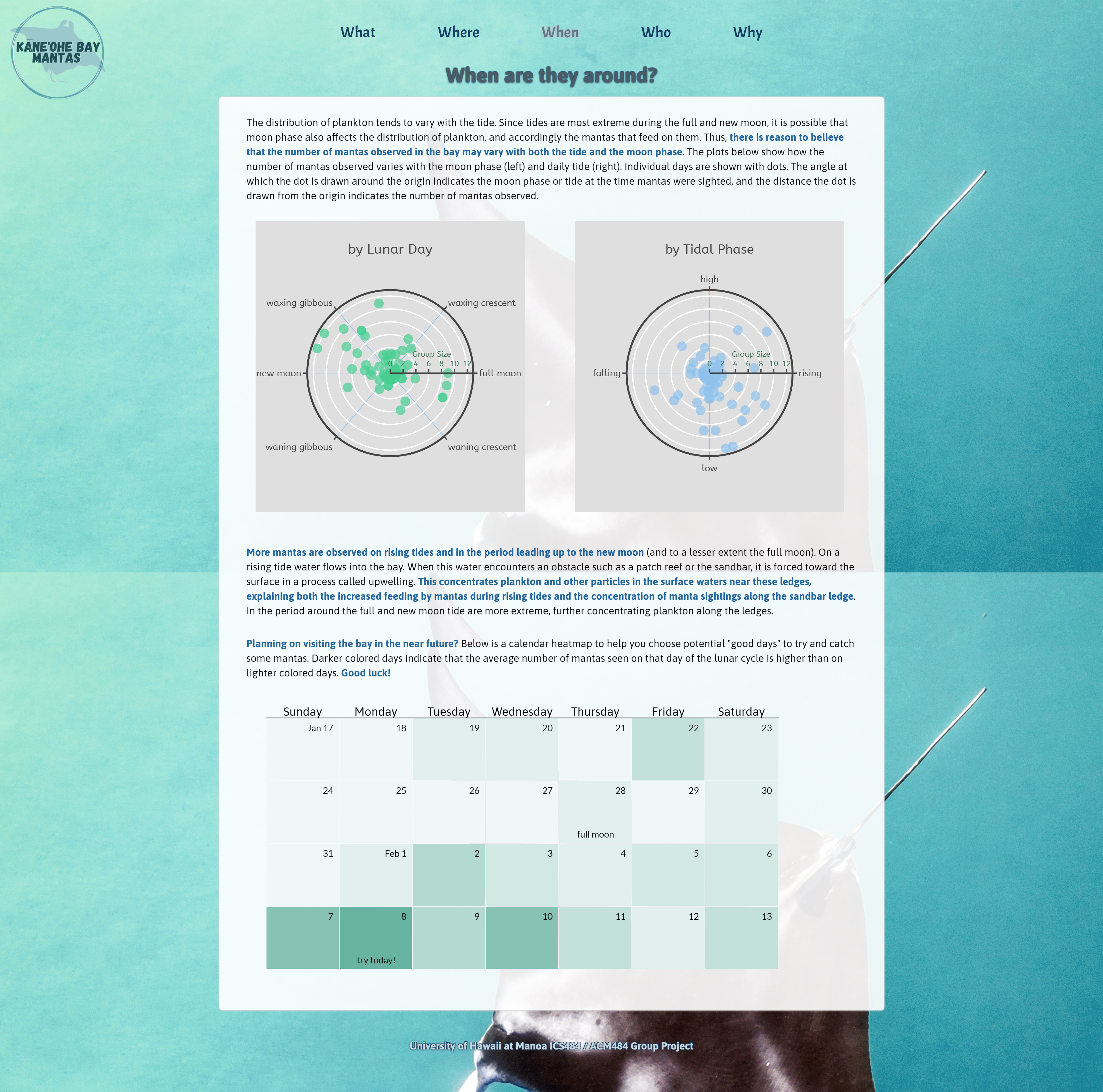
The question being answered on the "When" page is "When are they around?" or "When is the best time to spot a manta ray in the bay?" The first two plots on the page are basic polar plots that show the number of mantas spotted by lunar day and daily tidal phase. Each dot represents a day that mantas were spotted. It's angle represents what day in the lunar calendar (or tidal phase in the day) and the distance from the center represents the number of mantas spotted on that day. I chose this visualization because it is easy to see at a glance which days and tidal phases are associated with higher manta sightings. I created these using the plotly.js library. The third visual on the page is a heatmap calendar that I created using D3. It aggregates all the manta sightings by lunar day and uses the average number of mantas sighted on that lunar day to create a heatmap overlayed on a 4 week calendar. The calendar automatically shows the current week plus the next three weeks. I thought this would be an easy way for viewers to tell when the next "good" days for spotting mantas would be since most people don't just know what lunar day it is.
Reflection
I really enjoyed working on this project. I always enjoy the chance to be creative and I
think we came up with some interesting visualizations. I also appreciated the chance to
work with
real data and that we had a real "customer" to build for. Getting to work with the
domain scientist who cultivated the data was really helpful in making meaningful
visualizations. It was also helpful that he had a pretty clear idea of what he wanted to
get out of it.